GENERAL INFO
MY ACCOUNT
PRIVACY
Logo fonts can make or break your logo design. Choosing the right typography can help to tell your brand story and amplify the impact of your logo whenever and wherever people see it. But the wrong font could spell trouble. There are thousands of fonts for logos out there, and that’s exactly why we’ve put together this list of the most notable, game-changing logo fonts of all time.
Many of these fonts are dazzling as is, but don’t forget that they are also a great way to get inspired about your logo design. They can be altered and modified in a multitude of ways to give your brand a unique feel. Picking the right font for your logo is important, so be sure to spend some time selecting the perfect one for your brand.
Want to learn more about logo fonts? Watch the video below or read on to find out how to choose the perfect font, or fonts, for your brand!
Jump to:
How to select the perfect logo fonts
Start selecting your logo fonts by first determining your brand personality (how your brand sounds and feels to your audience). Then consider which fonts evoke those same ideas and feelings you’re going for.

A modern logo design with a custom slab-serif font by CBT

A vintage inspired logo design with a custom script font by DSKY

A powerful logo design with a bold sans-serif font by ultrastjarna
There are several types of fonts or font families to choose from, and each one tells a different brand story. Pick a font style and type that works with the style of logo you’re envisioning. Looking for a logo with a modern and minimal style? Then a sans serif font will be best for your logo. Want your logo to be more traditional and classic? Go with a serif font.
Serif logo fonts have decorative “feet” at the ends of each letterform and evoke a polished, classic feeling.
Slab serif logo fonts are bolder, louder serifs with large letterforms designed to be seen from a long distance.
Script logo fonts are both formal and casual typefaces that have the loops and flourishes of script handwriting.
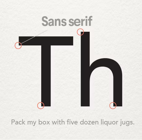
Sans-serif logo fonts lack the “feet” at the ends of each letterform and are considered more modern than their serif counterparts.


How many fonts should you use in a logo?
You should use no more than 2 or 3 different logo fonts in your logo design. Any more than that and your logo design will look too busy and inconsistent. The number of fonts also depends on the amount of text you’re incorporating in your logo. Choose one font for your main brand name and another font for additional supporting text, such as your tagline or brand description.
How to combine logo fonts?
When combining different logo fonts in one logo design you want to make sure the fonts complement each other.
Pick one main font for your brand name that represents your brand’s style the best. It should be the most eye-catching out of the fonts you selected. Any additional fonts need to be more subtle.
- It’s a good idea to combine a statement font with a more subdued sans-serif font.
- Another option is to combine different versions of the same font: try combining the font of your choice in italics, bold or all caps.
- Avoid combining different statement fonts, such as serifs with slab serifs or a script font with another script font.

Learn more about selecting a font for your brand here.
Here are the 61 top logo fonts everyone should know:
1. Bodoni


The Bodoni typeface surfaced during a time when typeface designers were experimenting with the contrast between thick and thin type characteristics. Giambattista Bodoni took that experiment to an extreme, creating this dramatic font. It has resonated through time in famous logos like Vogue and Calvin Klein, and is a great font to consider for mainstream fashion brands.
As you’ll see below, Bodoni has a lot in common with the Didot family of typefaces because it was created around the same time in history. Regardless, the Bodoni typeface has its own style.
Consider this logo font for fashion industries that are pushing the extremes on the runway!
2. Choplin

Based on the unconventional Campton font family, Choplin is a geometric slab serif by German type designer René Bieder. It’s modern, clean, and sturdy, drawing inspiration from Gill Sans and Johnston Sans while holding onto standout contemporary elements. As it lends itself well for photography layouts, editorials and assertive headlines, Choplin is a good font to consider for more assertive branding.
Choose this logo font for contemporary and narrative magazines and journals.
3. Garamond


Garamond is more of an umbrella term for typefaces than a single typeface. Many of the iterations we see in recent decades are interpretations of alphabets designed by Claude Garamond and Jean Jannon in the 16th century.
Interestingly, the Garamond typeface became one of the first “famous” typefaces when it was presented at the Paris World’s Fair in 1900, and dozens of variations soon followed. This fame has continued into later decades, as seen in the examples above.
Garamond has an elegant appearance. The serifs on each letter are carefully crafted to convey their own personality, most notably the ones on the capital “T”.
Because the serifs are so expressive, they can easily be used in a playful context—as seen in the early Apple branding. The refined letterforms also allow this font to be taken in a sophisticated direction—like in the American Eagle logo.
Consider this logo font for a professional and timeless logo with a flair of personality.
4. Yeseva One

Architectural, high contrast and eliciting a particular kind of distinct, feminine essence, designer Jovanny Lemonad created Yeseva One as a serif display of “a complete agreement between a man and a woman”. Named after the phrase “Yes, Eva”, you can clearly see the friendly disposition even from its decorative feet. Yeseva One works well with Roboto, Open Sans, Roboto Slab, and other balanced serifs.
Choose this logo font if you seek to communicate a conservative, agreeable and graceful approach.
5. FF Avance

FF Avance is a special typeface that pushes the envelope on asymmetrical serifs. The lower serifs of the capital “A” point to the right, while the upper serifs on the lowercase “v” point to the left.
Consider this logo font if you are looking to portray motion and energy. It’s a great choice for sports, automotive, and action-based industries.
6. Nunito Sans

Have a question?Ask our team.
Coming from Nunito, a balanced sans-serif typeface superfamily, Jacques Le Bailly created Nunito Sans as an extension and fresh alternative to one of the most popular sans-serif fonts in the Google Font Library. Nunito Sans goes along with Montserrat, Theano Didot and Abhaya Libre. Its high x-height (the distance between the baseline of a line of type and top of the main body of lower case letters) and short descenders (lowercase letters, such as g and y, that extend or descend below the baseline) grants an approachable display.
Choose this logo font for evolving and expanding corporations, to create healthy dialogue around what currently is and what it can become.
Find out more about the font Nunito Sans here.
7. Didot

Before Didot became known as a typeface, it was the name of a family composed of French printers, punch cutters and publishers in the late 1700s. They created many versions of Didot, one of which is used in the Giorgio Armani logo. Similar to Bodoni, the high contrast in line thickness creates drama. This font is also commonly seen in the fashion world. Didot works best when used simply, with careful kerning and high contrast colors.
Consider this font for a less dramatic fashion logo: one that is mature and classy.
8. Neue Swift

Neue Swift was designed to generate a horizontal flow, helping words and lines look separated and to read. This makes Neue Swift a great choice for wordy logos! The typeface also has distinct sloping serifs and “busy” angles.
Consider this logo font for financial, health or non-profit industries.
9. Gafata STD

Although Gafata STD was exclusively made for small size text in a medium to long context, this flexibility allows the font to work well when used in logo design in so many different platforms and applications. This whimsical sans-serif does wonders for mixing style and legibility, leaving an impression through ease and its minimal touches.
Choose this logo font if the intention is to apply your logo to a variety of situations for a diverse audience.
10. Big Caslon


Big Caslon is a revival from a group of serif typefaces from the 1600s by William Caslon I. This typeface is a great example of classic typeface styles entering the realm of digital typography. Most of the serifs feel sharp and pointy, while some, such as on the uppercase “G” and “S” are slightly geometric. Overall, Big Caslon feels bold and strong—perfect for making a big point.
Consider this font if you want your logo to feel loud yet retain a refined and elegant side.
11. Glober

Glober is known for excellent legibility through a broad range of language support and case-sensitive punctuation. Overall, it’s a classical font, but underneath those clean outlines and optimized spatial awareness, there’s a cozy appearance to these almost-too-perfect geometric forms. Make the most out of all of its options; pair Glober with bold, italicized and underlined supporting text within the same family.
Choose this logo font if you’re trying to go for technical, trendy and tender.
12. Canilari

Canilari could be considered somewhat of an outcast typeface. It’s hard to pinpoint where exactly it fits into the context of typographic history, and that’s great for inspiring creativity.
Sometimes a strange typeface is what a logo designer needs to take a brand out of the box.
Consider this logo font if you simply can’t quite put your finger on the right font for your business. This font’s thick and crude cuts could work well for a modern butcher shop or could add a homemade touch to packaged goods. Use your imagination!
13. Ostrich Sans

Aptly named and outstretched, Ostrich is a narrow sans-serif with smooth rounds and a very long neck. It’s currently only available in uppercase lettering, so use it wisely—especially if you mean to turn heads and make a long-lasting statement.
Choose this logo font if you’d rather shout than whisper, but in a polite way.
14. Modesto

Modesto has a very interesting history from 19th and 20th-century circuses and hand-painted typography. This digital iteration takes those analog forms and perfects them into a usable type family containing 23 fonts
Consider this logo font for your business if you feel inspired by vintage circus styles, classic wooden crate branding or cigar box designs.
15. Abril Fatface

Abril Fatface was inspired by the heavy titling fonts used in advertising posters in 19th century Britain and France. Titling faces themselves are a relic from a particular tradition, where designing means each typeface exists for optimal legibility and beauty at a specific size—this is where details truly count. Thin serifs, clean curves and refined touches automatically yield an elegant appearance. Abril Fatface is a part of Abril, a larger type family system designed by TypeTogether, which is well known for creating custom designs for major corporations.
Choose this logo font when you offer bespoke services to a wider audience, and/or if the details truly matter to you.
16. Rufina

Rufina applies classic typography standards to stencil design. Where Rufina departs, however, is in the placement of the character breaks. Rather than looking like a stencil, it almost looks more like an artistic puzzle, with contrast and perceived texture. This technique allows Rufina to go in stylistic directions that other stencil fonts can’t
Consider this logo font if you own an art gallery, an art-related business, or if you need to merge an artistic sensibility with a utilitarian aesthetic.
17. Aileron

Aileron is a Neo-Grotesque sans serif font with a distinguished and curved lower case letter “l”. It’s inspired by 1940’s aircraft models, where we were at the beginning of modern aircraft history. Models just began to fly higher and faster with powerful engines. Brazilian typeface designer Adilson Gonzales flew away with this concept and created a retro-futurist typeface encouraging aerodynamic nature. It’s close to Helvetica design-wise, and conceptually close to Univers, and would partner up well.
Choose this logo font for a sleek and futuristic look, ideal for clothing brands and startups.
18. Revista

No font list would be complete without a stencil typeface, and Revista is an exceptional example. It brings the elegance of a classic serif face and merges it with the utility of a stencil font. The broken letter forms lend a down-to-earth, DIY vibe and make a fashion-oriented font accessible to everyone.
Consider this logo font if your disruptive business aims to break—nay set!—trends.
19. Fenix STD

Uruguayan designer Fernando Diaz wanted to create a font that could be used simultaneously for long and short text without affecting legibility. Fenix was birthed; this serif typeface is inspired by calligraphy, and offers the chance for elegant readability in larger texts. It has rough strokes suggested from both sharp and edged curves. Spatial proportions are thoughtfully designed to save space in height and width. Fenix STD works well with Dosis, Open Sans, Raleway, and Exo.
Choose this logo font to evoke a classical and traditional wave in your logo design. If your company name is on the longer side, or if you’d like to include a slogan or motto, Fenix STD could be the right fit.
20. Rockwell

While Rockwell hasn’t been in the limelight recently, it’s a standout typeface from the 1930s. This is a classic slab serif face, which means that the serifs are unbracketed and of similar weight to the balance of each character.
Rockwell’s letterforms are pleasing in their simplicity. The shapes don’t feel overwhelming, even though they are complex.
Consider this logo font as the signature look of a business dealing in utility, construction or no-nonsense clothing.